

Are you planning to create the next standout ad design that maximizes your chances of winning customers? Perfect! But a stunning ad design is not something that can be created overnight. It requires some serious effort and in-depth detailing to get a perfect look.
Ever wondered how those amazing ad designs that you see on the social media pages are designed? There is no hidden secret to create design. It is just the result of using the right technique and adding the right details to the design. Here is a quick guide on the tricks that can make your social media ad design talk of the town:
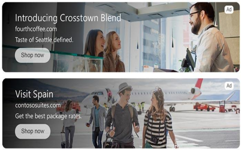
Keep Your CTA Precise & Clear
There is no doubt in the fact that a captivating Call to Action (CTA) can boost your conversion rate. According to the Facebook survey, a user spends no more than 1.7 seconds to go through a certain post. This surely indicates that the attention span for the users is quite small and marketers need to come up with something that could entice the users right away.
This is where a compelling and well-designed CTA can grab their attention. If your CTA is not clearly visible in the design, then this would reduce your chances of landing that prospect as your customers. To ensure that users pay attention to your CTA, make the text bold and choose color contrasts so that your CTA appears separately from the rest of the design.
Giving attention to the details stated above would increase your chances of instantly getting the attention of users.
Pay Extra Attention to Image Selection and Image Size

Text is not something that the users read at the first glance. It is the image that captures their attention first. Your ad might be competing with various other ads on the same page. What is the element that can make your ad stand out from those competitor ads? That secret element is the ad image. You must spend a considerable amount of time before finalizing a specific image for the ad. The chosen image must be in accordance with the theme of your brand.
You should never compromise on the quality of the image, whether you use editing tools or create design online. Use a high-quality image with no distortion of pixels at all. Align the text in such a way the main theme of the image seems to be crystal clear.
Besides the selection of the image, there are some other core elements that need attention as well. The size of your image is also important to the impression which your ad creates. There are specific aspect ratios and size recommendations for each kind of ad design. Following these recommendations makes your ad look professional and worth clicking. You can read various guides to know about social media image sizes.
Make your Ad Design Similar to Your Landing Page Design
This is the detail that most of the designers overlook. Yes, you must put a great emphasis on the fine details of your ad design. But coming up with the design that does not resonate with the design of your landing page would bring you no benefits.
Imagine an ad design that seems compelling by all measures. Once the user gets attracted by the ad and decides to proceed with your landing page, what he witnesses is a massive difference between the design details of both. This would instantly create a bad impression of your brand.
Conversely, an ad design with details similar to the landing page increases credibility. Font, design color, nature of images, and all other fine elements of your design must be perfectly aligned with your landing page. Doing so would take you one step closer to winning visitors as leads.
VistaCreate offers some of the most amazing features and design options to make it convenient for brands to create design online.
Color Contrasts Always Entice the Viewers
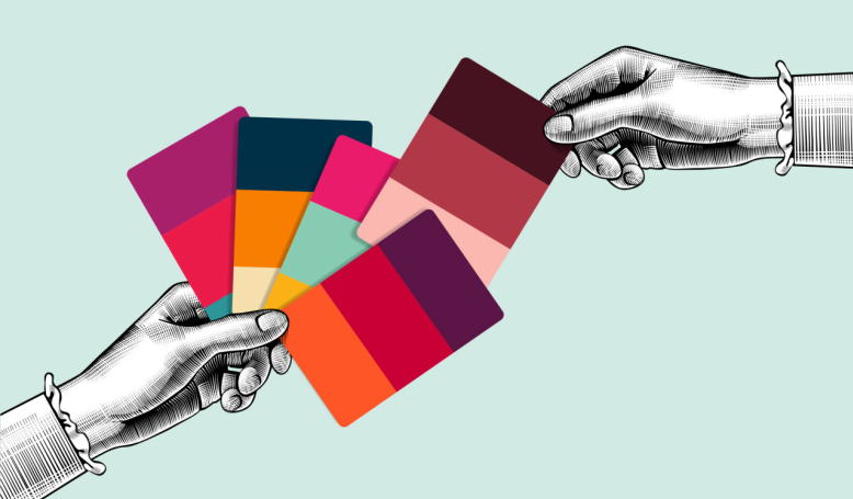

Color contrast is something that is pretty obvious, but still overlooked in ad designs. There is a specific color scheme that a brand adopts for its ad design campaign. But merely sticking to one color does not make the cut. You should always use color contrasts to differentiate between various elements of your design.
For example, you can add color contrast between your text and the background color. Choose the perfect combination of colors to ensure that your final design does not look like a mess. A typical contrast used in ad designs in a white text over a black background. Options are endless. You can also come up with your customized color contrast as well.
Before you choose colors, you must also be aware of the psychology behind the colors. If your audience comprises young people, then you can easily go for brighter colors. But if your audience comprises elder people, then you should always prefer colors with lighter shades. There are a lot of online guides about color schemes for social media ads.


